Список разделов » 3D Уроки » 3D Making of
Сон | The Dream - Making Of...
| Автор: Elddim | Спасибо огромное за статью! | ||||||
| Автор: RIDDICK | Рад что статья понравилась!
YarrY, благодарю за сцену!!!!
Думаю напишу об этом отдельную статью
Муторно не то слово.... ужас как. А можно поподробнее о твоем способе?
Апсолютно согласен. Сделано вообще это было для англоязычной публики, и с хитрым подвохом, который таки сработал как я и ожидал))) Статью заметили сразу несколько англоязычных ведущих ресурсов и предложили ее перевести на чистейший английский в обмен на право разместить у себя на сайте))) Так что скоро будет и перевод человеческий | ||||||
| Автор: Rusty | Хм, понятно. Значит, зря трудился. Ну, как бы то ни было, выложу свой перевод.
Greetings. This is the "making-of" article for those who liked "The Dream" picture. Your host for the next few minutes is me, Alexey RIDDICK Kashpersky.
Composition and reference materials
Setting up the composition of your picture is a crucial step of your work; leaving it without proper attention will make a viewer to forget your picture with the hit of the "forward" button...
I'll say more: I've been tweaking the composition of the picture till almost the end of the project, gradually refining it, changing bits here and there... You can call it a "grinding" of the initial idea. Here are some examples of composition sketches from various project stages.
The original idea included a chair into composition, so I started to devise an appropriate design for the chair. Although it was replaced with the water splash in the final version, it was one of the evolution steps worth mentioning.
You can treat the composition as a professional black-and-white photograph ¬— with its bright white highlights, grey mid-tones and deep dark shadows. Generally speaking, there are three layers, and this rule applies to everything — colors, saturation, objects in your scene, ranged by complexity and importance. True or not, that was the plan I tried to stick to during my work. In "The Dream" the girls' figures are the core element of the picture, with the water splash coming next in the order of importance, and the background as the least important element. Same rules apply to the color scheme of the picture. Vivid contrasting colors at the foreground fade into softer tints of the background. To put it in more imaginative way — just imagine yourselves standing on a giant multicolored palette amidst the morning mist — this would probably help you to understand the things I'm telling.
Another thing I'd like to point your attention at is the reference materials preparation. Don't disregard this stage, learn as much as you can about the subject you're going to picture. Search for similar works, there's always a chance someone have made a similar picture before. If you happen to find an element in someone else's work that you think would suit your work as well, don't be shy to contact the author to find out what challenges did he face during the creation process, what are the possible pitfalls, and then think of yet a better way to create the said element. Speaking about human body modeling, it's definitely a must to find a dozen or two of the photo refs of the body part to be modeled. To make it even a better start, make the necessary pictures yourselves, posing your model the way you need it for your composition — but do it before you even started the modeling stage, or you could find yourself in a situation when it's obvious you have to correct your model, but you don't want to lose the fruit of your hard work. You then think it's OK and will work as it is... but it won't. A trained eye is sure to see all your model's flaws.
I'd like to express my gratitude to the professional photographer Olga Shelegeda for providing the reference photos ... Besides that, I cruised all over the internet in search of the requisite ref pictures of hands and palms, feet, folds and wrinkles, clothes, splashes, various body poses; I made pictures myself, studying the live examples, I drew it on paper, trying different composition variants, etc... At the end, there were no less than 500 various reference pictures in my collection. With this variety it became much more clear which way to go and which path to take.
Working in Z-Brush. Sculpting
In Z-Brush, I started with transposition. There is quite a number of lessons on this subject already, mine included, so I won't be elaborating on that.
That's what the base models looked like after the initial transposition.
As you see, the body proportions are distorted significantly. I would correct them gradually as I sculpt. I put out ready all the anatomy refs I had, mounted two displays on my desk and even had the third one at times (my laptop) — all of them to display the refs I needed. It's really a very comfortable way of working. It only takes a slight turn of your head to see the ref you need and you instantly know what step you do next. It actually reminds me of drawing or sculpting from life.
That's what I had after a few sessions. You can see, the position of some body parts are to be changed later. The model looks better now, but still a whole lot of problem areas.
I went on sculpting the body keeping an eye on my anatomy refs, until I was pretty happy with the result. Here's what I had at the end of my sculpting sessions.
Some problem areas still remain at this point (kersey-like skin on the back, etc), but they're to be fixed at the texturing stage, so I'm done with the sculpting now. It's time for the first visualization tests, I made a few renders of my models with mental ray.
Model texturing
I muchly like the process of texturing "live" organic surfaces. Not sure why some find it unpleasant... My idea was to render the skin in mental ray, so that I needed three texture layers for the skin besides the bump and specular maps. I started with painting the outmost texture layer. I won't elaborate here on technical details of the process, there are plenty of tutorials out there... Just a few not so obvious comments. Different body parts have different skin tones; legs usually have bluish tint (or green — depends on lighting). The closer to toes, the more reddish the skin gets, and so there's a more general rule — the thinner the skin is, the more red its tone gets: think of fingers, knees, elbows... It gets yellow where the body accumulates fat (belly and buttocks). A woman's breast is comprised of a special kind of adipose tissue, with lots of blood vessels, covered with thin skin, that's why its skin tone is the lightest. Taken into account when painting, those nuances add to your picture the elusive charm and vivacity immanent to all creatures of flesh and blood. Just look through Boris Vallejo's pictures once again for instance, and you'll sure to notice all the said tone nuances, even if you've never paid attention to those things before.
That's what the outmost layer of skin texture looked like, rendered with mental ray.
As you see here, I already sketched the shape of the drapery. At that stage, I intended it to be only drapery with no water, so here goes yet another composition sketch.
Here I'm starting to paint another layer of skin texture, the underlying one. It's full of veins, blood and raw flesh. No worries though — it will only a benefit for our model.
The render could easily scare a sensitive person, but don't be. Superimpose the previous texture layer on it, and you get a rather nice result for the default render settings.
The next step was the trial and error search of the ideal skin shader parameters. It took a few days and a myriad of shader setups, here is just a few of them.
Till I finally settled on the setup I was happy about.
Notice that these renders already have the light set up properly (more on that later) and have all the texture maps applied. Here is the skin shader setup for mental ray — Fast Skin Material. The shader is different for the two models, though difference is not significant.
Please take my advice and don't thoughtlessly copy the shader setup parameters, in most cases it just won't do any good for you. Gone through this in the past, trying to copy setups from different CG artists, but the results never were something that I expected. Never, till I taught myself which slider affects what in the rendering. I don't know really why copying the parameters doesn't usually work — is it the world scale that matters or something else... Anyway, these screencaps are here just to help you to understand the basics of the SSS shader setup. One short comment about the settings of the bump map: unfortunately, I've lost the scene file, so the values you see there are not the actual ones used to render the final picture, but the ones I restored from my memory (pretty close I hope).
Lighting
I spent quite a time setting up the lights for the scene. At the beginning I couldn't understand why FArea lights that give those convincing soft shadows refused to work. I tried to use simple Sun light instead, with the results nowhere near what I was trying to achieve. Then, all of a sudden I realized I needed to boost the power of FArea lights a great deal higher. Having that done, I added a few reflecting planes of various colors to the scene to create some nice picturesque diffuse reflections on my models.
Now all the light sources, all reflectors and reflections are on their places. There are three main FArea light sources of various colors, one auxiliary Omni light, and four large colored reflecting planes.
Water modeling
This particular task is going on record as the most tedious work I've ever done on the computer. I needed 3,000 spheres to be placed each exactly on its place in the three dimensional space, with no cloning, as I wanted to maintain the "natural feel" of moving water; I didn't want it to look like a set of cloned pieces. I did that during a week, with a few takes each day, approximately two hours each take. I just couldn't stand more than two hours of continuous sphere dragging; needed a break every now and then, to change the color of spheres, the colors of models, the background color of workspace windows, and maybe even the Windows color scheme — just to keep my sanity. By the end of the week I was ready to give up the idea of modeling the water with this technique, but finally managed to finish it. Really annoying though is that I had to cut the large portion of the mesh that was such a pain to model out of the final composition. Here is a few comments on the modeling process in case someone wonders. A special thanks go to the author of the technique used here - Abramyanc Karen Arsenivich. I started to model the water splash by extruding polygons from the meshes of the girls' figures — those ones that were touched by water.
I had to retopologize the models for the mesh was too dense to work with.
I then started to shape the splash.
Tweaking the shape further, I modeled the piece where water transforms to cloth.
And that's where the sphere fun actually began.
This cute little tree is the fruit of a weeklong drudgery. Most of the work is now done, we only have to turn this tree into water. To do that, I exported the mesh in obj format and loaded it to Z-Brush. A Unified Skin modifier was applied then with maximum detalization and zero smoothing. At last, I polished the resulting mesh with the smoothing brush. One could think it's a better idea to use the smoothing parameter of the Unified Skin modifier to get smoother result — but it's not, as most of the minor mesh details would lose during the automatic smoothing. The manual smoothing takes ten times more time but you preserve all the detail you need.
The resulting water splash.
Hair
I used Ornatrix to create hair. I'm quite happy with the plug-in's flexibility. Everything seems to work just fine except one thing: it won't render neither in mental ray nor in V-ray, so I had to render it with the Max's scanline and then to overlay onto the renders through the alpha channel.
Here's the Photoshop overpainting. Thanks to Elena Vuytsik for helping me with this.
Same with the lower girl's hair.
Rendering, postproduction.
To render the final picture I used mental ray for figures and the first pass of the water and V-ray to render the second pass of the water. I rendered water in two passes just because I couldn't make mental ray water to look right, so I used V-ray and simply merged the two passes in postproduction.
Having all the rendered pictures merged in Photoshop, I started to paint the background. It is hand-painted, with the figures superimposed through the alpha channel. On top of all that, I overlaid the hair.
The only thing left is a couple of Photoshop tweaks using the AlienSkin filters. So this is it. Thanks for your attention, hope that the time you spent reading this article is not just a waste | ||||||
| Автор: RIDDICK | Rusty, Вау! Спасибо огромное! | ||||||
| Автор: Neutrino | Большое спасибо за статью, Риддик! Прочитал с удовольствием. Отдельный респект за 3000 сфер | ||||||
| Автор: Vadim V |
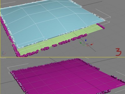
1. Конвертим болванку в Editable Poly (или меш, кому что нравится) и копируем нужные крайние грани как на картинке. Таким образом образовались небольшие полигоны для распределения скаттером.
2. Распределяем на эти полики нужный объект, в данном случае сферу. К сожалению, я смог распределить только по выбранным полигонам, по выбранным граням не нашел такую функцию. Как вариант можно распределить по всем гряням и удалить лишнее.
3. Повторяем операцию небходимое количество раз на новых болванках, изменяя размеры сфер их количество и т.п.
4. Конвертим обратно в поли и удаляем ненужные полики.
5.С помощью софт селекшена можно избавиться от параметричности, также можно объеденить все объекты в один меш, для удобства.
6. Можно применить модификатор нойз, или любой параметрический по вкусу.
Результат, конечно, хуже чем ручками, но можно эксперементировать, я по-быстрому прикинул, да и когда есть основная масса, дальше можно также вручную характерных деталей придать | ||||||
| Автор: RIDDICK | Vadim V, большущее спасибо! Думаю кому-нибудь обязательно пригодится | ||||||
| Автор: MiVlaX | Огромное спасибо за статью! Невероятно полезна! | ||||||
| Автор: winter | RIDDICK Отличная работа и статья! Только сейчас прочитал и вот что подумал, после переваривания в голове твоего процесса создания воды и капель: Офигеть, ты форменный маньяк!!! | ||||||
| Автор: FedDark | круто! а слабо всё это заанимировать? ))) шутк | ||||||
| Автор: AndRiEL | Классная статейка, и Риддик молодец, отличная работа. Сразу хочу спросить, у тебя есть какое-то специализированное художественное образование?
p.s.: Вообще в таких статьях хотелось бы видеть чуточку больше технической стороны вопроса, чем теоритическую. Не превращать конечно в типичный туториал для желто-ротиков, но всё же | ||||||
| Автор: RIDDICK | MiVlaX winter FedDark AndRiEL, спасибо))
Есть, в профиле указано
Здесь не согласен) Уроков разнообразных сейчас тьма. И технарей много. А вот людей которые обращают внимание на художественную сторону вопроса, их меньше. И материалы встречаются реже. Ну это мое ИМХО | ||||||
| Автор: Eol-dark_elf | RIDDICK, очень серьезная работа. Было интересно посмотреть вип и увидеть на збрашцентрале. Скажи, мне интересно, а модели женщин сам делал (балванку я имею ввиду)и если да, то делал их специально для этой картинки?
PS. жду урока про epedermal срочно!!!!!))))) | ||||||
| Автор: RIDDICK | Eol-dark_elf, спасибо
Нет, не сам. Болванки покупные
невижу в этом смысла для каждой работы новую делать.
Полистай мейкинг оф | ||||||
| Автор: Ant3d |
|
Количество просмотров у этой темы: 62508.
← Предыдущая тема: "DragONtFLY" - GTsw


 Не зря трудился -
  Результат шикарный.

 В хорошем смысле слова ))) Представляю какая это была муть... ))


 Рид спасибо! здоровски всё, ты мастер! вдохновил на ссс.... ))


 2015 © ART-Talk.ru - форум про компьютерную графику, CG арт, сообщество цифровых художников (18+)